Every time I go back to the DIA Beacon I have different kickass experience. For starters its an architecturally incredible space. In fact I think it is such a good space that you can view art there that would otherwise be totally boring and inane, but once you see it in the context of this enormous renovated factory space with plentiful natural light and breathing room it becomes transcendent. Nice trick. I’m not going to go picking on the pieces that I find boring and mundane, I think it is more constructive to focus on that which was inspiring and thought provoking. Keep in mind the fact that I’m no art historian (well, maybe an amateur art historian) and I haven’t researched the artists’ intent in these instances. That is one of my favorite things about that 60s minimalist or conceptual art in general though- it really makes itself available to the viewers interpretation. I’m always happy to throw my interpretation around so here you go.
On this trip to the DIA I was taken by three different things. Blinky Palermo, Robert Ryman, and Lawrence Weiner.
1)
Blinky Palermo’s “To the People of New York City” series really caught my attention on this visit, mostly because I’ve been thinking a great deal lately about visual literacy, visual rhetoric, and visual narratives. His canvases were remarkably icon-like and reminded me of the graphic innovations of someone like Ladislav Sutnar, arguably one of the grandfathers of modern-day interaction design rhetoric. Apparently Blinky had no real intention of creating a pattern-driven vocabulary, but his German flag-inspired sequences of four panels certainly had me thinking about that. How can one create a specific narrative from color fields? Is the vocabulary of a visual narrative so culturally embedded that it cannot be specifically referential without some kind of defined cultural parameters of knowledge for the viewer, like a key for a map, or a glossary for a technical volume? Thanks to Blinky for getting me thinking about such fun stuff. Btw, Blinky Palermo, your name suggests that you were a rat wearing a sombrero.
2)
Robert Ryman got me going too, and that’s kind of fun considering he is Mr. White Canvas. Technologist and futurist Adam Greenfield (I wonder how he’d feel about these labels) writes about seams and seamlessness as we move into the era of ubiquitous connectivity. Adam places great importance on that moment in which you lose reception as you are talking on your cellphone and then move underground onto the subway platform and either keep a continuous signal (not here in NYC), lose it briefly and have to call back, or just lose the signal. These seams become important moments where you recognize your humanity in relation to the media you are connected to: consider the moment in the Matrix when Keanu Reeves realizes that humans are all just batteries. That is all of the ramifications of seamlessness taken to an extreme. Nobody had any idea they became batteries. So how fun is it that Ryman plays with the seams of physical art objects, that he completely negates the content of the art and just takes your attention to the seams, the edges of a canvas, a board, the screws that mount it to a wall, or the mirror ground upon which a field of white extends nearly to the perimeter? My favorite piece was series of hollow core doors, displayed about 3 feet from a wall, lined up side by side. When examined from the back, the means by which they are attached and made plumb are clear: holes were cut from the thin ply exposing the framework construction of the doors, and then bolts were run through connecting them to each other. In a typical carpenters markup, lines were drawn on the back describing how the panels should be aligned. But regardless of the near-perfect lineup from the back view, close inspection from the front revealed the imperfections. The seams were still apparent. Did Ryman prophesize the importance of seams in ubiquitous digital connectivity by accident when he exhibited the seams of his physical art objects years ago? What is the relationship between the “seams” in physically interactive architectures and the “seams” in interactive virtual architectures?

3)
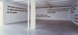
Finally, Lawrence Weiner. The show at the Whitney Museum is not to be missed, but the piece at the DIA, the “5 Figures of Structure”, sums it all up since it is far more accessible. Roberta Smith of the NY Times recounted an important quote in her review of the Whitney show: “In 1969 Mr. Weiner issued a well-known statement of intent describing the three conditions in which his works could exist: they could be constructed by him, fabricated by someone else or not built at all.” In the “5 Figures of Structure”, Weiner takes three walls and 5 long, large sentences to describe a series of slabs and their relationship to one another. Then, on a fourth wall, in a very simple diagram, arguably a simple information graphic, he says the same thing in far less space. This is a powerful statement, demonstrating visual communication is a simple, direct tool to describe the spatial relationship of objects, and that words, poetic as they may be, grow confusing. Or… is it a powerful statement, demonstrating words as a vehicle for the imagination to work as a visual tool, an interpretive force with which the mind can create its own visualizations?